

Update: You can check out the finished diorama here
I've finished up the night-watchman for my entry for the Halloween themed painting contest that my local GW store is hosting. I think the pose of the model really conveys the shock & horror that one would experience upon seeing the dead rising from the grave. He kinda reminds me of a character from a B horror movie, like an angry villager from a Frankenstein film (I watched a lot of Mystery Science Theater back in the day).
The painting was very straightforward, although the torch was a new experience for me. After building up a solid base coat for the yellow I began to paint the fire starting with a orange-yellow (heavy on the yellow) and then progressively adding more red into the mix until I built up to a red-orange. For the tips of the flames I added a little Chardon Granite and black into the last orange mix, to make the flame look sooty. In doing this, you're basically layering the color, except you're starting with the lighter color and building up to a darker color towards the top of the fire. Fire is hottest and brightest at the center of the flame where the source of the fuel is, so you want this part to be bright. Read the instructions on a fire extinguisher, where does it say to point the nozzle to put out a fire? It almost seems counter intuitive when you paint it, but this is how a real fire looks.
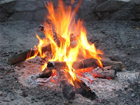
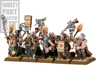
For example, take a look at GW's flagellants, whose torches are painted with a darker color towards the inside of the fire with the tips of the flames white, and you can see why traditional dark-to-light layering doesn't create a realistic effect.
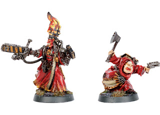
Now go look at the Redeemer from Necromunda and see how a realistic the fire looks!
Next up is the base for my Halloween diorama, which is assembled and needs to be painted. If you're curious as to any of the other colors on the model, drop a comment with your question.
Looking nice!
ReplyDeleteOh man, I wish more painters would take the time to think about this before painting up their backwards fires. Every time I see an 'Eavy Metal mini with red flames fading to yellow it makes me sad.
ReplyDeleteA similar principle should apply to glowing effects - most people add directional lighting around the object, but then highlight with lighter colours at the edges. This makes it look like the stone is reflecting light from another source. Real glowing things make everything else around them look darker, and their outside edges should be the darkest part!
Flames have always been one of those things that eluded me. The "Reedemer style" flames do look much more realistic though. Thanks for the tip. :)
ReplyDeleteGbwhatsapp
ReplyDeleteYowhatsapp
Freedom